Why Correlation Matters in Trading
Before diving into the practical how-to of using screenshots to show correlations between markets, let’s reflect on why correlation is a vital concept in trading. Have you ever noticed how sometimes gold prices move in tandem with the US dollar, or how oil prices seem to pull currency pairs like USD/CAD along for the ride? Understanding these relationships can give traders an edge in anticipating market moves, managing risk, and diversifying their portfolios.
Market correlation refers to the degree to which two or more assets move in relation to each other. Positive correlation means they trend together, while negative correlation means they diverge. There are also cases of zero or weak correlation, where movements are largely independent. But without clear, visual evidence, grasping these relationships can feel theoretical — even elusive.
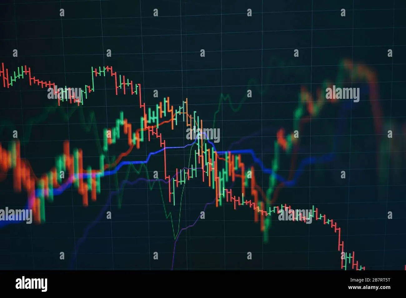
This is where screenshots come in handy, particularly for trading educators, signal providers, and influencers. A carefully crafted image from a trusted platform like MetaTrader can effortlessly communicate complex data, enhance credibility, and significantly improve engagement with your audience.

How Screenshots Enhance Understanding of Market Correlation
If you’ve ever tried to explain correlation purely through words or raw numbers, you know it’s like trying to catch smoke with your bare hands. Adding visual context via screenshots does three crucial things:
- Clarifies complex concepts: Visuals help break down jargon and abstract ideas into tangible, digestible pieces.
- Builds trust: Transparent, high-quality screenshots showing real trades or charts prove authenticity.
- Improves recall: Our brains are wired to remember images far better than text alone.
But, not all screenshots are created equal. A blurry, cluttered, or unprofessional image can do more harm than good. That’s why tools like the Trading Screenshot Generator have become game-changers for trading professionals.
This innovative web tool allows you to select precisely the timeframe, indicators, and trade details you want to highlight from MetaTrader, then generate a pristine, annotated screenshot in seconds. The impact? Your audience gets a crystal-clear window into market behavior — with zero distractions.
Step-by-Step Guide: Using Screenshots to Show Correlation Between Markets
Ready to create those powerful visuals that drive home market correlations? Here’s a detailed guide to get you started.
1. Identify the Markets to Compare
First, select the two or more assets you want to analyze. Common pairings include:
- EUR/USD and GBP/USD (major currency pairs)
- Gold (XAU/USD) and the US Dollar Index (DXY)
- Oil prices (WTI) and CAD/USD
The key is to choose assets with a known or suspected correlation that your audience will find relevant.
2. Choose the Timeframe
Correlations can vary dramatically depending on your timeframe. Daily charts might show a correlation pattern invisible on hourly charts, for example. If you’re aiming to demonstrate long-term trends, pick a daily or weekly chart. For intraday strategies, a 5-minute or 15-minute chart might be more appropriate.
3. Open MetaTrader and Set Up Your Charts
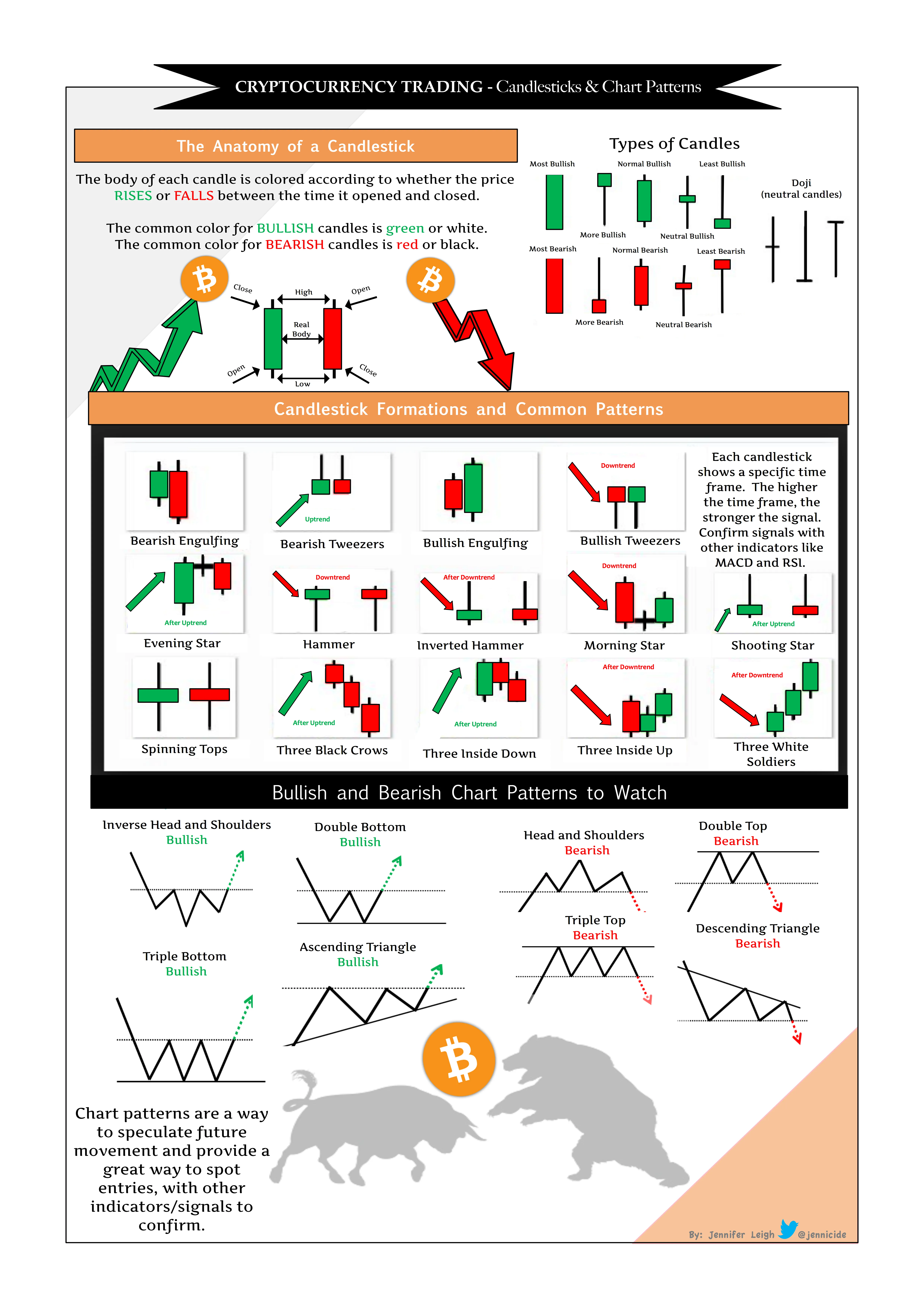
Load both assets on separate windows or tabs within MetaTrader, apply consistent indicators (like moving averages or RSI), and align their timeframes.
Pro tip: Applying the same analytical tools not only standardizes your comparison but also lets your audience follow your logic more easily.
4. Use the Trading Screenshot Generator
This is where the magic happens. Instead of fumbling with clunky print screens or manual editing, use the Trading Screenshot Generator to:
- Select your MetaTrader window or chart
- Crop and focus strictly on the relevant area (e.g., the overlapping period between two charts)
- Add annotations like arrows, highlights, or notes to emphasize specific movements
- Customize labels, timestamps, and branding to maintain professional consistency
Within moments, you’ll get a clean, polished screenshot ready to embed in your blog, social feed, or trading course.
5. Compare and Annotate the Screenshots Side-by-Side
Present your screenshots side-by-side in your content with clear annotations pointing out the synchronous moves that illustrate correlation. Use callouts like:
“Notice how EUR/USD and GBP/USD both bounce at the 1.1800 level during this timeframe.”
“The inverse relationship between Gold and the US Dollar Index is evident here, with price peaks nearly matching price troughs.”
The clearer the narrative you create, the more your audience trusts and grasps the insight.

Best Practices for Leveraging Screenshots in Market Correlation Analysis
To truly harness the power of screenshots in showing market correlations, keep these best practices in mind:
- Keep it simple: Avoid overwhelming your screenshot with too much data or confusing overlays.
- Consistent color coding: Use the same colors for corresponding markets across charts for easy comparison.
- Use annotations wisely: Highlight only the most critical points to maintain clarity.
- Update regularly: Correlations can shift, so fresh examples keep your insights relevant.
- Brand your images: A subtle logo or watermark from your profile using the screenshot tool builds recognition and discourages misuse.
Common Pitfalls When Demonstrating Correlation—and How Screenshots Help Avoid Them
One trap some traders and educators fall into is relying too heavily on numbers without context—like simply quoting a correlation coefficient without visible support. It often leaves audiences unconvinced or confused. Screenshots provide that essential context.
Another challenge is capturing real-time examples. Market conditions can change so fast, sharing outdated or irrelevant data reduces your credibility. The ability to generate, customize, and update screenshots within moments allows you to stay current and authoritative.
Enhance Your Audience Engagement with Visual Proof
Imagine Sarah, a financial influencer who used to struggle explaining how oil prices impact currency pairs. By adopting clean, annotated screenshots from MetaTrader, she transformed her weekly newsletters into dynamic, visually rich stories that her followers eagerly awaited.
Her engagement rates soared, her subscriber base grew, and she was soon recognized as a trusted voice in commodity-linked forex trading. Now, every signal she sends comes with visual proof – a transparent window into market forces at play.
Technical SEO Tips: Optimize Your Correlation-Screenshots Articles
For those bloggers and educators publishing content on this topic, here are some SEO pointers to maximize your reach:
- Include related keywords naturally: market correlation examples, trading correlation charts, MetaTrader screenshot tool, visual trading analysis.
- Use descriptive alt-text for all images to enhance accessibility and image search visibility.
- Structure your content clearly with subheadings for improved readability and search indexing.
- Link internally to related educational articles or product pages (like the screenshot generator) to improve site authority.
- Encourage user interaction with downloadable content – for example, “Download this sample correlation screenshot” or “Try generating your own with our tool.”
Wrapping Up
Using screenshots to show correlation between markets isn’t just a matter of convenience — it’s an essential strategy that transforms abstract data into compelling, trustworthy evidence. By leveraging a purpose-built tool like the Trading Screenshot Generator, educators and trading pros can quickly create clean, branded images that elevate their message and build lasting relationships with their audience.
So next time you want to illustrate how two markets move in harmony (or opposition), remember: a single, well-crafted screenshot can be worth a thousand words — if not a thousand pips.